Spring can change a mall’s mood before shoppers reach the first display. A pale green arch, coral planters, and soft yellow window graphics can make a familiar corridor feel fresh. But color choices must work beyond a single photograph. They need to suit the mall’s lighting, existing finishes, tenant signs, and busy walking routes.
What are the best color palettes for spring mall decorations? The answer depends on the space, the audience, and the atmosphere the design should create. Art theorist Wassily Kandinsky wrote, “Color is a power which directly influences the soul,” in Concerning the Spiritual in Art. His observation offers a useful starting point, though mall designers also need practical checks. A pastel palette may look gentle on a mood board, then appear washed out beneath bright ceiling lights. Test samples on site.
This guide explores ten palette tips, from fresh greens and warm neutrals to brighter floral accents. It considers how to balance color, repeat key tones across signs and displays, and preserve clear contrast around essential wayfinding. Small details matter: a mint backdrop can calm a seating area, while a few peach-colored panels can draw attention to a seasonal storefront. Yet more color is not always better. Some combinations may feel crowded, and a scheme that photographs beautifully can still be tiring in person. Careful testing, thoughtful placement, and a willingness to revise are part of good design.
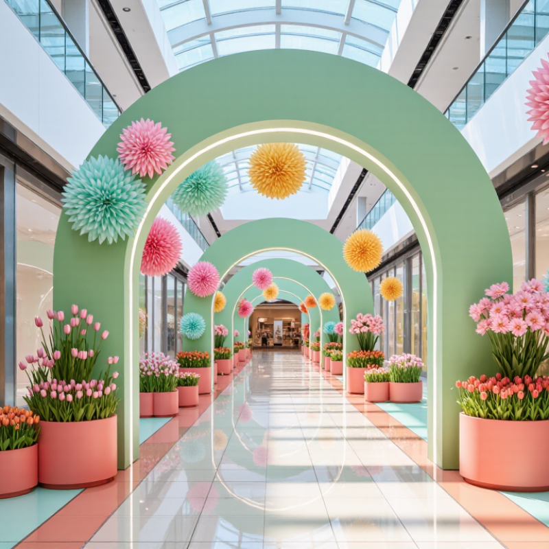
Spring palettes work best when color responds to light, scale, and visitor movement, rather than seasonal clichés alone. Begin with a quiet base, such as warm ivory or pale stone, then add fresh green, soft yellow, or coral in measured areas. Keep one color dominant, one supporting, and one as an accent. This simple hierarchy helps displays feel clear instead of visually noisy. Test it there. Before ordering large quantities, place samples beside the mall’s actual flooring and under its evening lights. Pale mint can look gray beneath cool LEDs, while yellow may seem sharper beside glossy surfaces.
Color can also guide attention. Use stronger saturation near entrances or seasonal displays, then softer shades along long corridors and seating zones. Repeat a few hues across planters, overhead ribbons, and wayfinding details to connect the space. Check contrast from several metres away so signs remain easy to read. Natural greens pair well with wood tones, but too much green may make a busy mall feel like a garden shop. Not every combination works. A palette can look balanced on screen and fall flat at full scale, so a small mock-up is worth the extra day. Leave room for adjustments; lighting, crowds, and nearby storefront colors can change the effect.
| # | Color Palette Tip | Suggested Colors | Mall Decoration Use | Spring Color Principle |
|---|---|---|---|---|
| 1 | Start with a fresh green foundation | Leaf green (#568B5B), warm ivory (#F7F4E9), soft white (#FFFFFF) | Use green for foliage, planter surrounds, and wayfinding accents; keep large surfaces light. | Green suggests new growth, while pale neutrals prevent the scheme from feeling visually heavy. |
| 2 | Pair pastels with a clear neutral | Blush (#E8A7B8), pale blue (#A9CBDD), ivory (#F7F4E9) | Combine pastel banners or display panels with neutral walls and flooring. | A neutral gives gentle hues visual breathing room and helps maintain a calm, uncluttered look. |
| 3 | Use one dominant color and two accents | Sage (#A7BE9B), coral (#E88972), butter yellow (#F2D477) | Let sage cover the larger visual area; reserve coral and yellow for focal details and seasonal props. | A dominant hue creates cohesion; limited accents direct attention without competing for it. |
| 4 | Balance warm and cool hues | Peach (#F2B59B), mint (#A9D7C0), soft white (#FFFFFF) | Place warm peach near cool mint in floral displays, seating-area decor, or overhead installations. | Warm and cool colors add contrast and variety; white helps connect the two sides of the palette. |
| 5 | Choose colors that work with daylight | Sky blue (#9FC8E3), light lilac (#C7B6D8), white (#FFFFFF) | Use light, cool shades near skylights and bright atriums; review samples in the actual space. | Daylight changes how colors appear, so checking samples under site lighting helps avoid unexpected shifts. |
| 6 | Repeat a small accent for visual continuity | Butter yellow (#F2D477), sage (#A7BE9B), warm ivory (#F7F4E9) | Repeat yellow in modest touches across entrance decor, directories, and central displays. | Repetition helps separate areas feel connected, while limited use keeps the accent distinctive. |
| 7 | Use floral colors as highlights, not as the whole scheme | Lilac (#B9A6CE), soft pink (#E8A7B8), leafy green (#568B5B) | Bring flower-inspired colors into small installations, planters, and seasonal display details. | Concentrated floral accents evoke spring while leaving room for architecture and tenant displays. |
| 8 | Coordinate colors with natural materials | Sage (#A7BE9B), terracotta (#C98263), sand (#DCCDB6) | Pair these hues with wood-look finishes, woven textures, and neutral stone surfaces. | Earthy tones temper brighter spring colors and complement common natural-texture finishes. |
| 9 | Keep signs readable against decorative colors | Deep green (#315C46), pale mint (#DCEDE2), white (#FFFFFF) | Keep essential text on a simple, high-contrast background rather than a busy pastel pattern. | Strong light-dark contrast supports legibility; verify text contrast for the intended sign size and viewing distance. |
| 10 | Limit the palette across shared spaces | Sage (#A7BE9B), blush (#E8A7B8), ivory (#F7F4E9), one accent hue | Use the same core colors in entrances, corridors, and atriums, adjusting their proportions by area. | A consistent palette helps large interiors read as one environment while allowing focal zones to stand out. |
A spring palette should feel connected to the mall, not like a temporary display dropped into it. Begin by noting the building’s materials, proportions, and existing colors. Warm stone, dark metal, and pale timber each change how seasonal shades appear. A historic arcade may suit soft coral and leafy green, while a bright, modern atrium can carry clearer yellow and blue.
Check samples beside the actual floor, wall, and ceiling finishes. Mall lighting can shift color noticeably, especially between skylit areas and enclosed corridors. Brand colors should guide the palette, but they do not need to dominate every decoration. Color isn’t decoration alone. Use one main shade across larger installations, then repeat two supporting colors in planters, banners, and seating details. This creates continuity without making every zone look identical.
Test it first. Place full-size samples in several locations and review them in morning and evening light. Keep walkways visually calm, and avoid placing strong colors where they compete with important signs. A common oversight is choosing colors from a screen; printed material and real finishes can look quite different. Even a carefully matched palette may feel too cool beside warm stone, so leave room to adjust after a small installation.
Spring mall palettes work best when seasonal color meets the building’s existing materials. Pair fresh greens with soft yellow, then add coral or warm pink in smaller areas. Keep stone floors, glass, and signage in view; they already contribute color. A practical starting point is a 60:30:10 split: dominant neutral, supporting seasonal hue, and a small accent. It is a design convention, not a scientific formula. Test it beside real shopfronts, not only on a screen. Small details matter. A pale green ribbon can disappear against cool glass, while the same shade may glow beside warm wood.
Lighting can shift the balance. The Illuminating Engineering Society’s Lighting Handbook uses roughly 300 lux as a common ambient reference for retail areas, with display zones often brighter, near 500 lux. Treat these as starting points; finishes and daylight change what visitors actually see. Check samples beneath the mall’s installed lights, then revisit them at dusk. I still find that pastel schemes can look washed out under strong overhead lighting. A deeper accent or textured fabric may restore contrast without making the space feel heavy. Keep key routes clear, and use stronger color at entrances, seating pockets, and photo-friendly installations rather than across every surface. Testing one bay first can reveal awkward color clashes before the full decoration goes up.
Spring palettes work best when they guide movement, not just decorate a photograph. At entrances, pair fresh green with warm cream, then add a small coral accent near directories or seasonal displays. Keep signs high-contrast and easy to read. A beautiful entrance can still confuse visitors.
Carry one anchor color into the aisles, but vary its intensity. Pale botanical tones can mark open routes, while deeper shades help frame seating or display zones. The U.S. Energy Information Administration’s 2018 Commercial Buildings Energy Consumption Survey reports that lighting accounts for about 17% of commercial-building electricity use. Lighting also changes how colors appear, so test paint and fabric samples under the mall’s actual fixtures before ordering. Cool LEDs may make a soft green look sharper than expected.
In shared spaces, use restrained color blocks to make seating areas feel distinct without creating visual clutter. Repeat a warm neutral across benches, planters, and ceiling details; reserve brighter spring hues for cushions or temporary displays. Leave some surfaces calm. Too many coordinated accents can make a walkway feel busy, and color alone cannot fix poor circulation. Review the palette from several approaches, including beside storefront glazing, where reflections may alter its balance.
Applying color palettes across entrances, aisles, and shared spaces
Use fresh greens, soft yellows, blush pinks, and sky blues as coordinated accents. These suggested planning values give entrances the strongest seasonal impact, while lighter touches keep aisles and shared spaces comfortable and easy to navigate. Percentages are illustrative design recommendations, not measured survey results.
A spring palette works best when lighting supports its undertones. Soft peach can turn orange under warm lamps, while pale green may look gray beside cool white light. Check large color samples in morning daylight and again after the mall’s evening lights come on. Test it at dusk. For corridors with mixed lighting, choose a steady neutral white and compare samples at several viewing points. Keep brighter accents near entrances, where natural light can wash out softer shades.
Materials also change how colors feel. Matte painted panels soften strong hues, while polished stone and metal reflect nearby colors and light. Pair a fresh floral tone with pale wood or textured fabric to prevent the space from feeling overly glossy. Repeat one or two palette colors in planters, seating details, and directional signs, but leave clear areas between decorative clusters. Too many small accents can make a broad walkway feel visually busy. Use washable, durable finishes in high-touch areas, and check sample boards against the actual floor and wall surfaces. A palette can look balanced on paper yet feel flat across a large atrium; adjust the contrast after seeing it at full scale.
Start with warm ivory or pale stone. Add fresh green, soft yellow, or coral in measured areas.
Choose one dominant color, one supporting shade, and one accent. This keeps the display clearer.
Flooring and lighting can change how colors appear. Pale mint may look gray under cool LEDs.
Check them in morning daylight and after evening lights switch on. Test them at dusk.
Use stronger colors near entrances and displays. Keep corridors and seating areas softer.
Pale wood and textured fabric can soften glossy surroundings. Matte panels also reduce visual glare.
Repeat one or two colors in planters, seating details, and signs. Leave clear space between clusters.
Check contrast, lighting, and nearby storefront colors. A palette that looks balanced on paper may feel flat in an atrium. I would still allow time for another adjustment.
Spring mall decorations feel inviting when their colors reflect the freshness of the season while complementing the building’s architecture and overall character. What are the best color palettes for spring mall decorations? A thoughtful starting point is to pair soft greens, floral pinks, sky blues, or warm yellows with calm neutrals. Use brighter shades as accents and balance them with quieter tones to create visual interest without overwhelming shoppers.
Apply the palette consistently across entrances, aisles, and shared spaces, adjusting the color intensity to suit each area. Entrance displays can make a lively first impression, while softer combinations may help busy walkways and gathering spaces feel comfortable. Lighting, materials, and decorative details also affect how colors appear: natural textures can add warmth, and carefully chosen illumination can enhance seasonal hues. When these elements work together, the mall feels cohesive, fresh, and easy to explore.

Arden Decor