Arden Decor
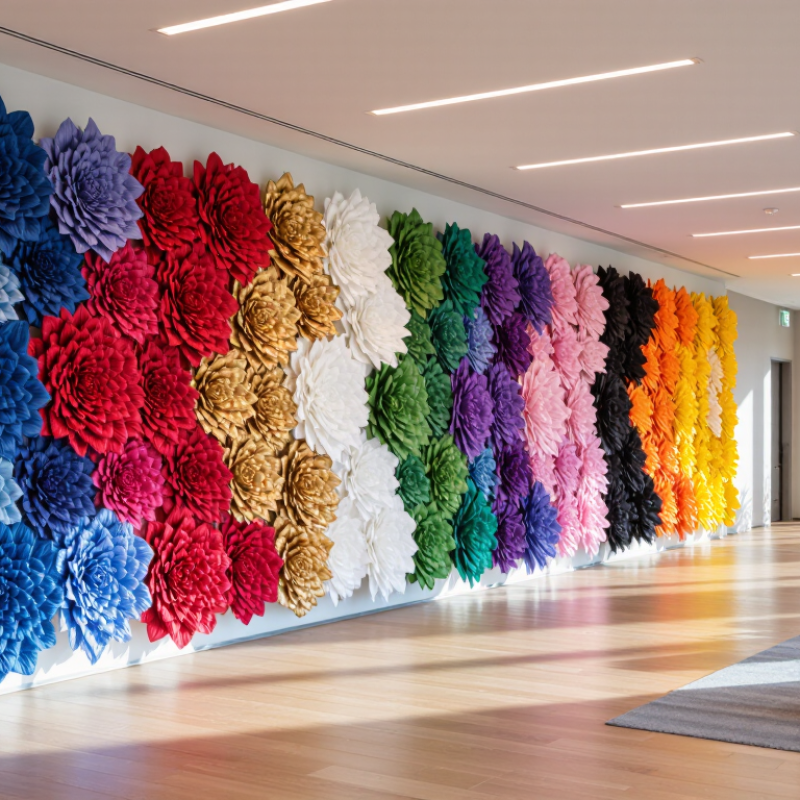
Paper flower color can shape how a corporate space feels before visitors read a single message. In event styling, I have seen color influence attention, mood, and perceived professionalism. White suggests clarity, trust, and clean communication. Blue feels dependable, calm, and organized. Red adds urgency, confidence, and strong visual focus. It can feel loud. Yellow brings optimism, openness, and creative energy, especially near reception desks or interactive displays. Orange communicates movement, warmth, and practical enthusiasm.
Green connects with growth, balance, renewal, and environmental awareness. Its effect changes with the paper texture and lighting. Pink softens formal spaces and can suggest care, approachability, or modern elegance. Purple often represents imagination, expertise, and premium thinking. Dark purple may look serious, while lavender feels more relaxed. These associations are useful, but they are not fixed rules. Cultural expectations and audience age can change the response.
Black gives structure, authority, and visual contrast. It works well as a backdrop or outline for lighter flowers. Gold suggests achievement, quality, and celebration. Metallic paper catches light beautifully, yet too much gold can appear excessive. A balanced palette usually combines one dominant color with one supporting shade. Test paper samples under the actual venue lighting. Small differences matter. My own choices are not always perfect; a color that looked refined on a screen once appeared dull in a large room. Reliable branding needs observation, adjustment, and honest review.